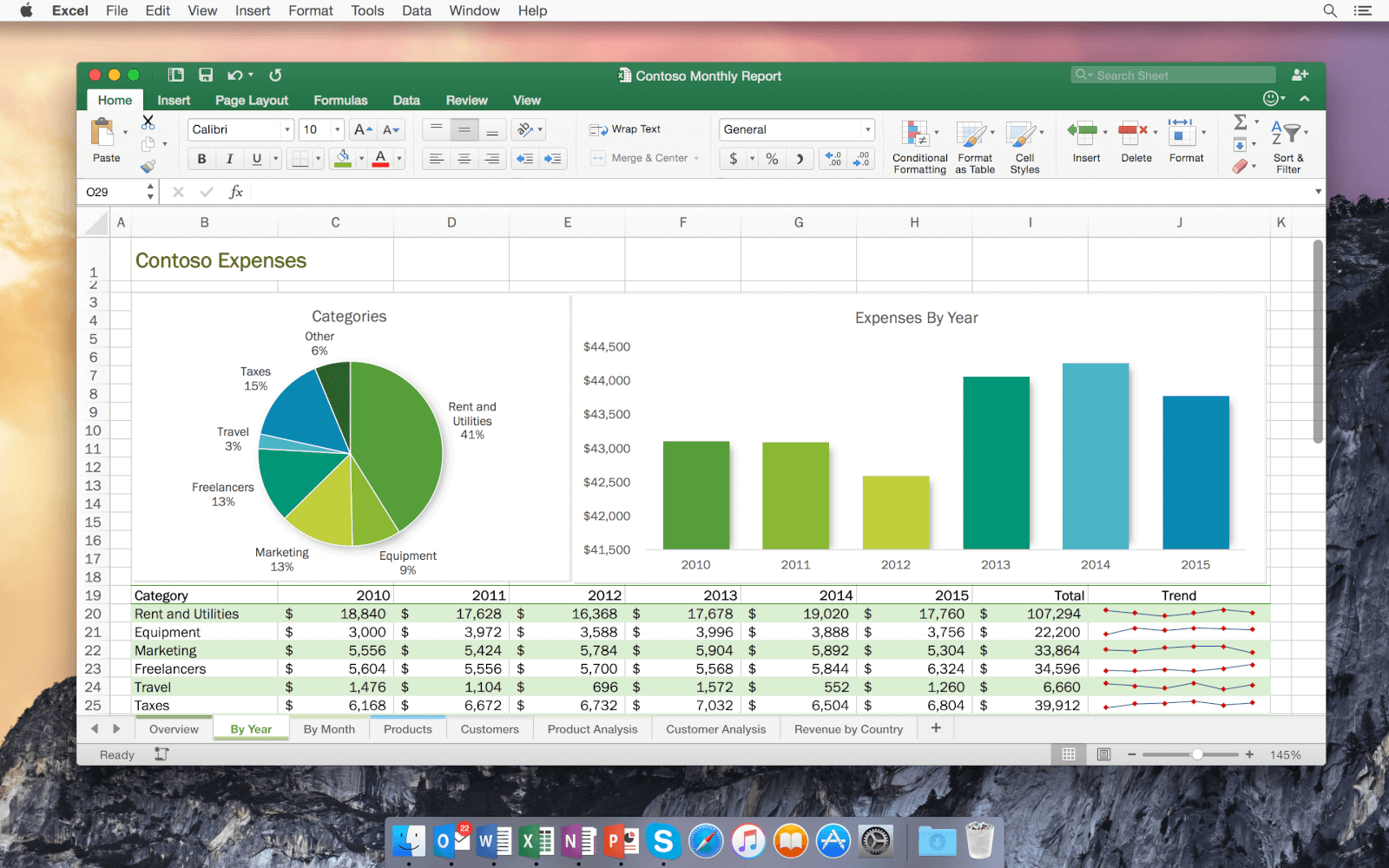
Create graphs and charts in Excel like a Pro
Microsoft Excel has been one of the most popular office applications for many years, allowing users from all over the world to solve a wide variety of issues. Not the last place in the list of application features is the construction of graphs and diagrams based on the available data presented in table format. This is what we want to teach you in this article, illustrating our words with simple examples. PlottingA graph is the simplest and most widely known type of a diagram, which implies displaying development, changes in any indicators in the form of curved lines. In Microsoft Excel, a classic graph is built very quickly. First, we need to create a table by placing in the first column the data that is supposed to be arranged along the horizontal axis, and in all other columns - the data that is to vary along the vertical axis. 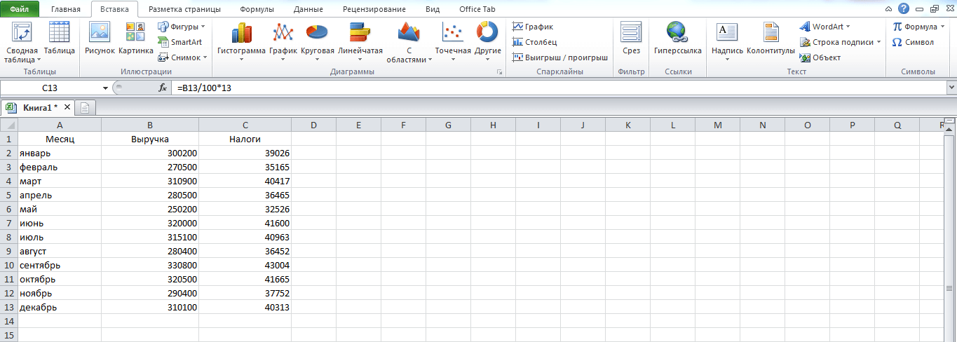
Next, in the main menu item " Insert " click on the button " Graph ", select the option that suits you and enjoy the result. After creating a chart, you can adjust it using the tools from the " Working with Charts " section. 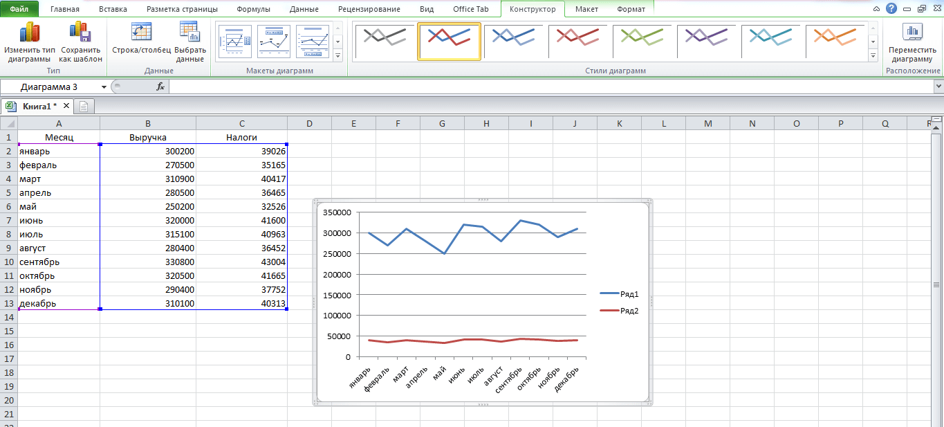
Building a Gantt chartThe Gantt chart is most often used to visualize the due dates of any tasks. There is no simple and convenient tool for creating it in Microsoft Excel, but you can build it manually using the following algorithm: 1. Create a table with task names, start dates and the number of days to complete each task. 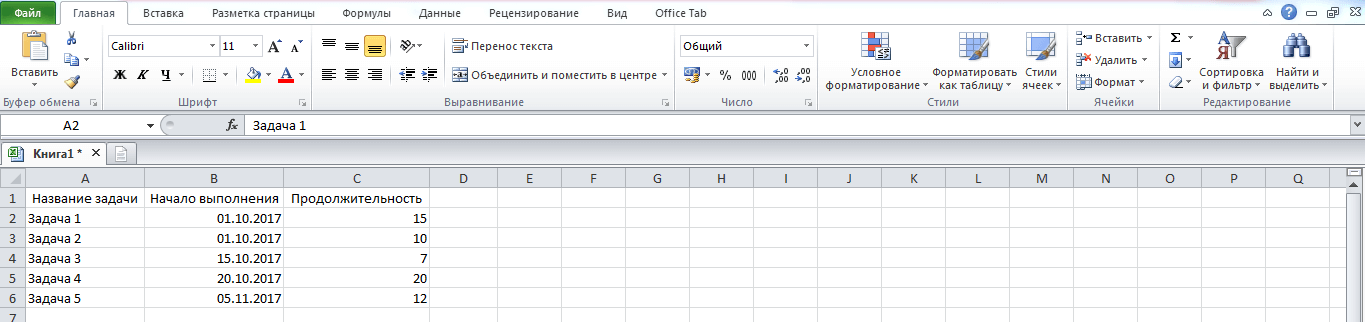
2. In the main menu item " Insert ", click on the button " Ruled " in the section " Charts "And select" Stacked ruled "from the drop-down list. You will have a blank diagram. 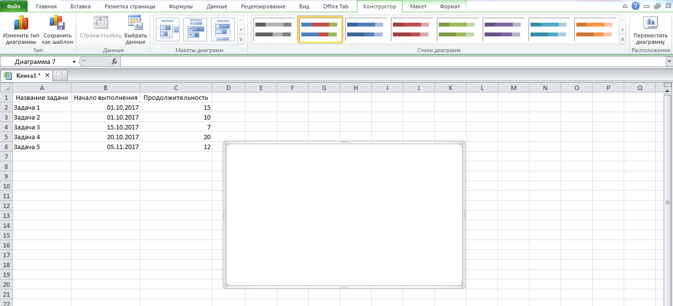
3. Right-click on the currently empty chart and select the " Select Data ... " menu item. In the window that opens, click on the " Add " button in the " Legend items (rows) " section. 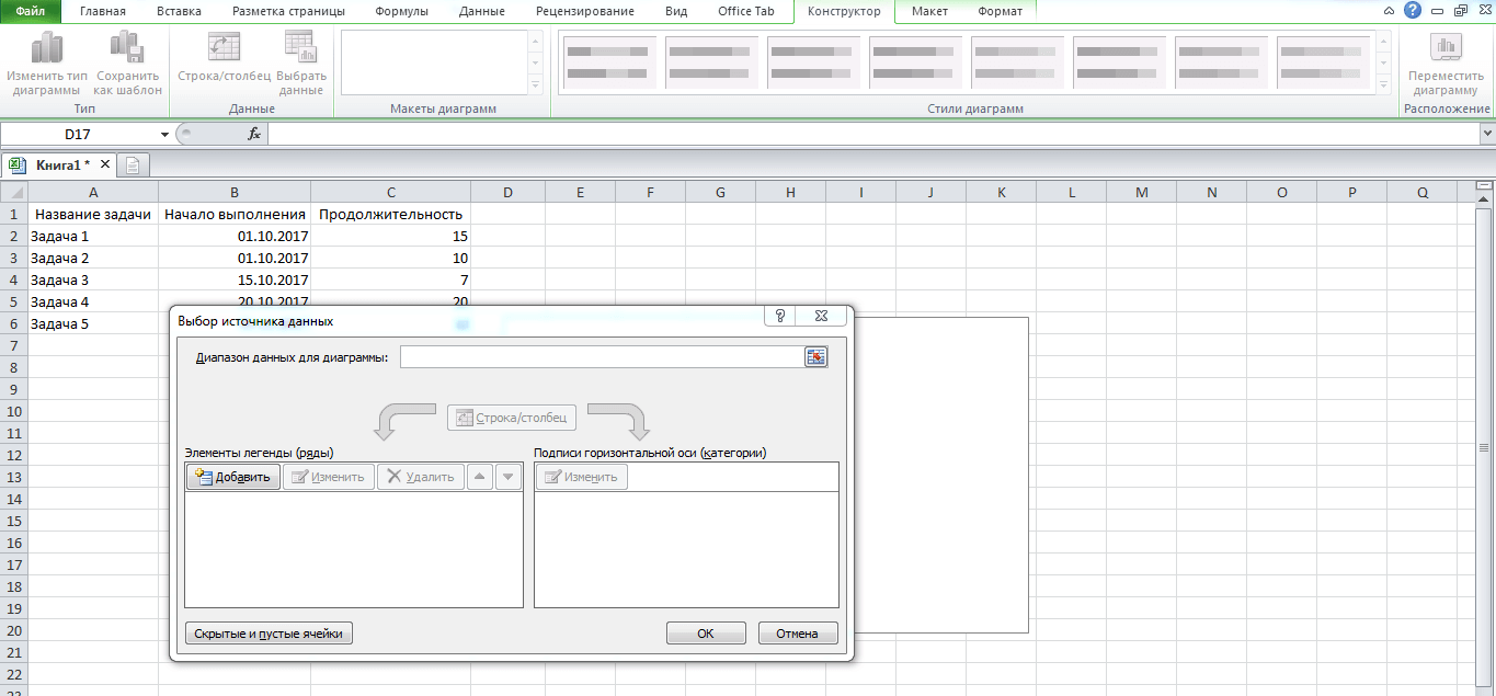
4. In the appeared window titled " Editing a series " you will need to enter data on the column with the dates of the start of tasks. To do this, click in the field " Series name " and select this entire column, and then click in the field " Values ", remove the unit and select all the necessary rows from the column with dates ... Click Ok . 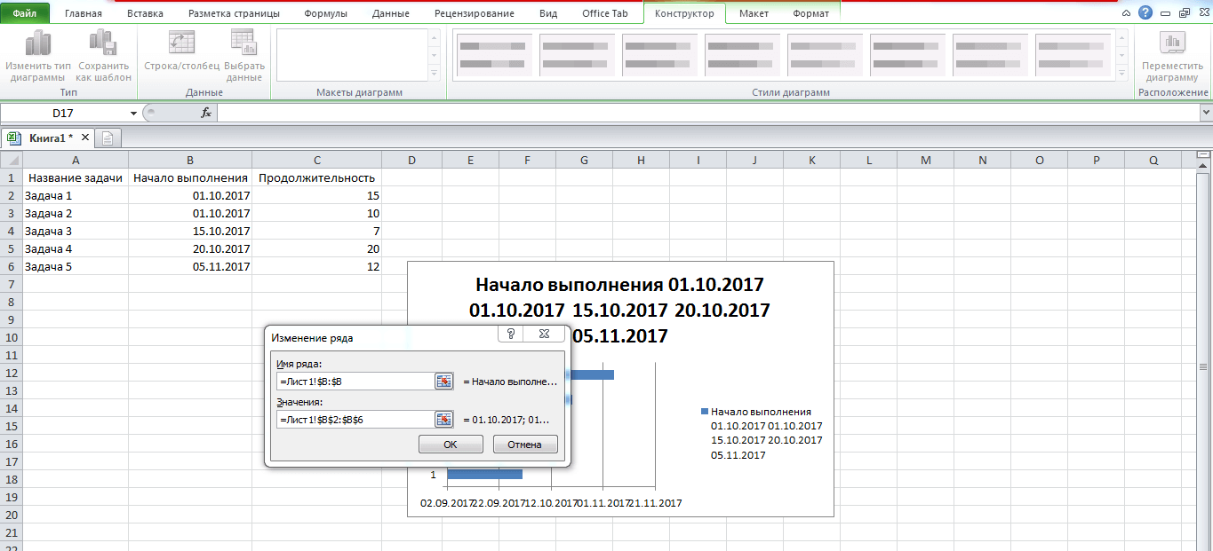
5. Similarly (by repeating steps 3 and 4), fill in the chart with the number of days required to complete each task. 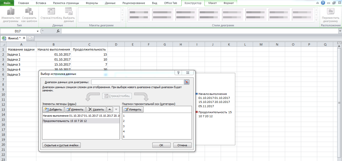
6. All in the same window " Select data source ", which opens by right-clicking on the diagram and opening the item " Select data ..."from the context menu, click on the" Modify "button in the" Horizontal axis (category) labels "section. In the dialog box that opens, click on the " Axis label range " field and select all the task names from the first column. Click Ok . 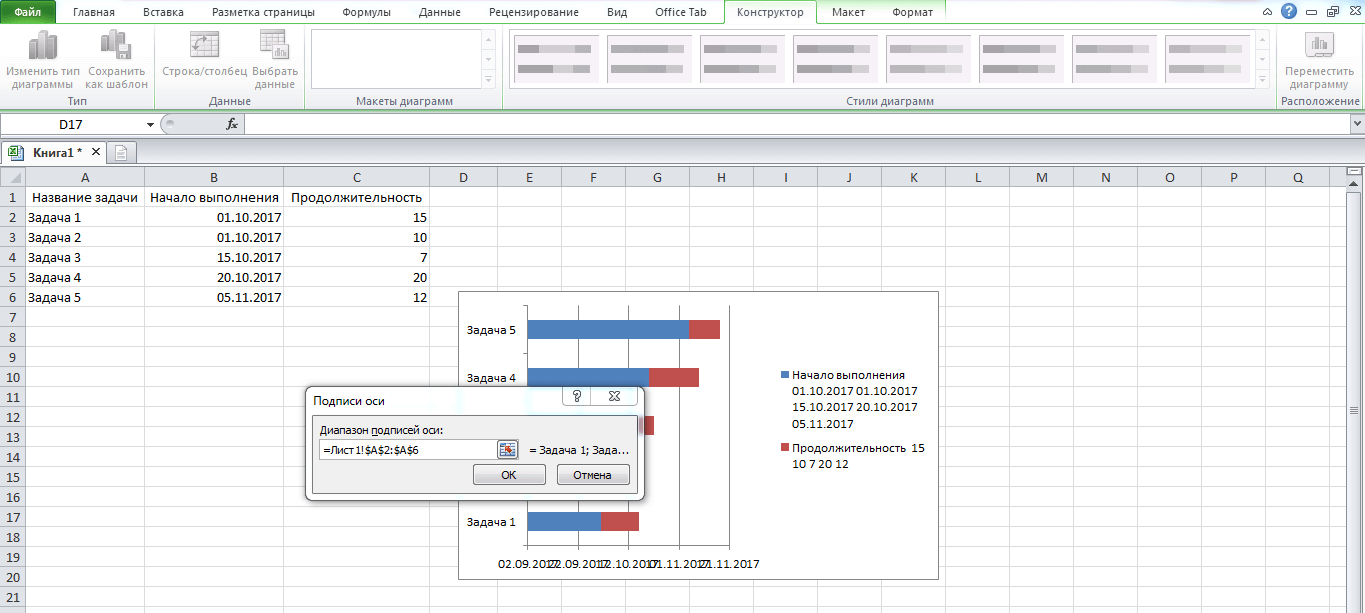
7. Remove the legend from the diagram (in our case, it includes the " Start " and " Duration " sections) that takes up the extra place. 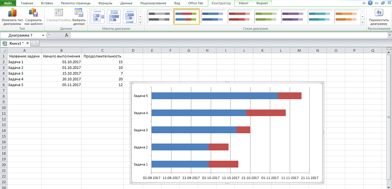
8. Click on any of the blue parts of the chart, select the item " Format of data series ... " and remove the fill and borders in the corresponding sections ("No fill" in the section " Fill " and " No Lines " under " Border Color "). 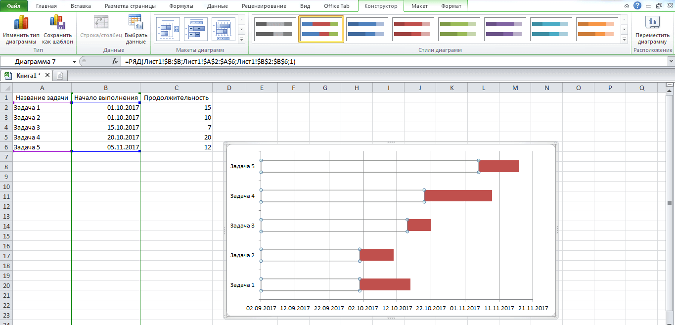
9. Right-click on the field where the task names are displayed and select the section " Axis format ... ". In the window that opens, click on " Reverse order of categories " to display the tasks in the order in which they were entered in the table. 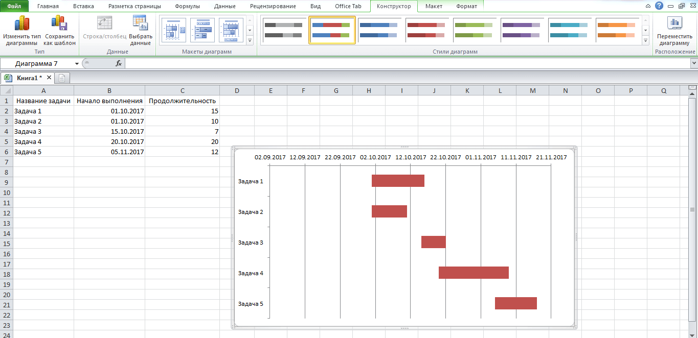
10.1. The Gantt chart is almost ready: all that remains is to remove the empty gap at its beginning, that is, to correct the time axis. To do this, right-click on the start date of the first task in the table (not in the diagram) and select " Format cells ". Go to the " General " section and remember the number you see there. Click Cancel . 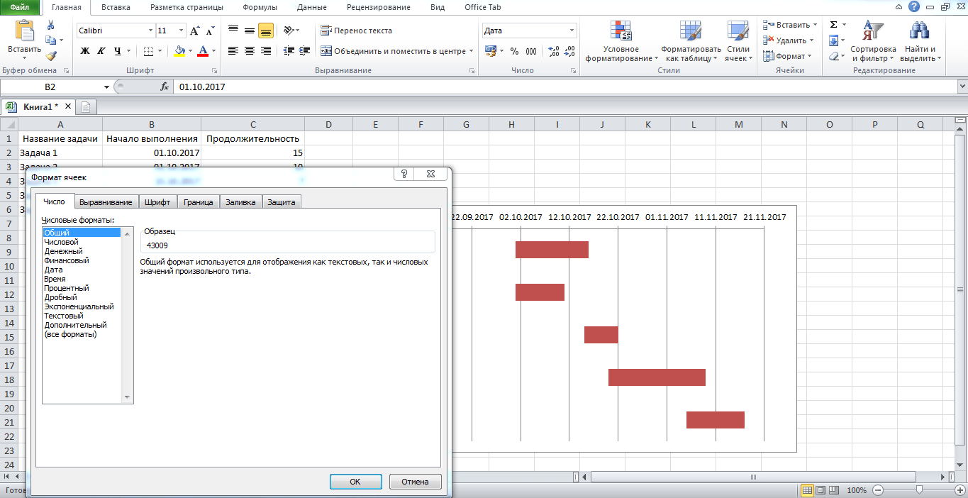
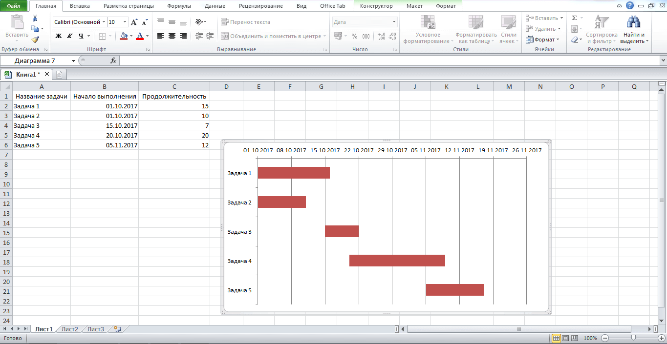
10.2. Right-click on the chart field where dates are displayed and select " Axis Format ... ". In the " Minimum value " section, select " Fixed " and enter the number that you remembered in the previous step. In the same window, you can change the price of the axis divisions. Click " Close " and admire the result. 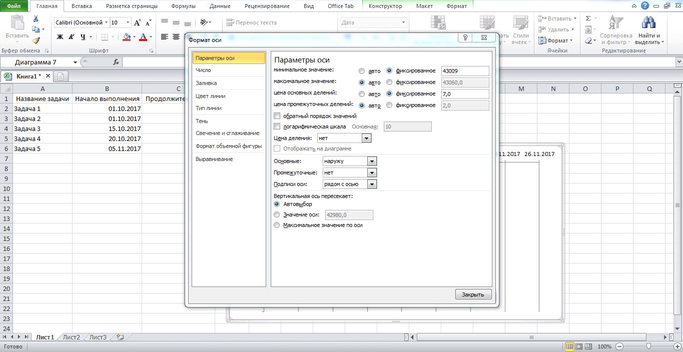
Building a pie chartA pie chart allows you to visually see what part of the overall whole are any elements in percentage terms. It looks like a kind of cake, and the larger the piece of such a cake, the more important the corresponding element is. There are special tools for such a chart in Microsoft Excel, so it is easier and faster to execute than a Gantt chart. First, of course, you will need to create a table with the data you would like to display in a percentage chart. 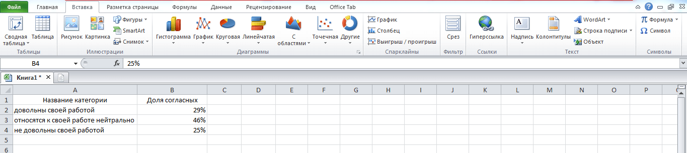
Then select the table that you want to use to create a chart and select the desired item from the " Pie " section in the " Charts " group of the " Insert ". In fact, the task will be completed. You can format its result using the commands of the context menu that appears when you right-click on the diagram, as well as using the buttons in the top bar of the main menu. 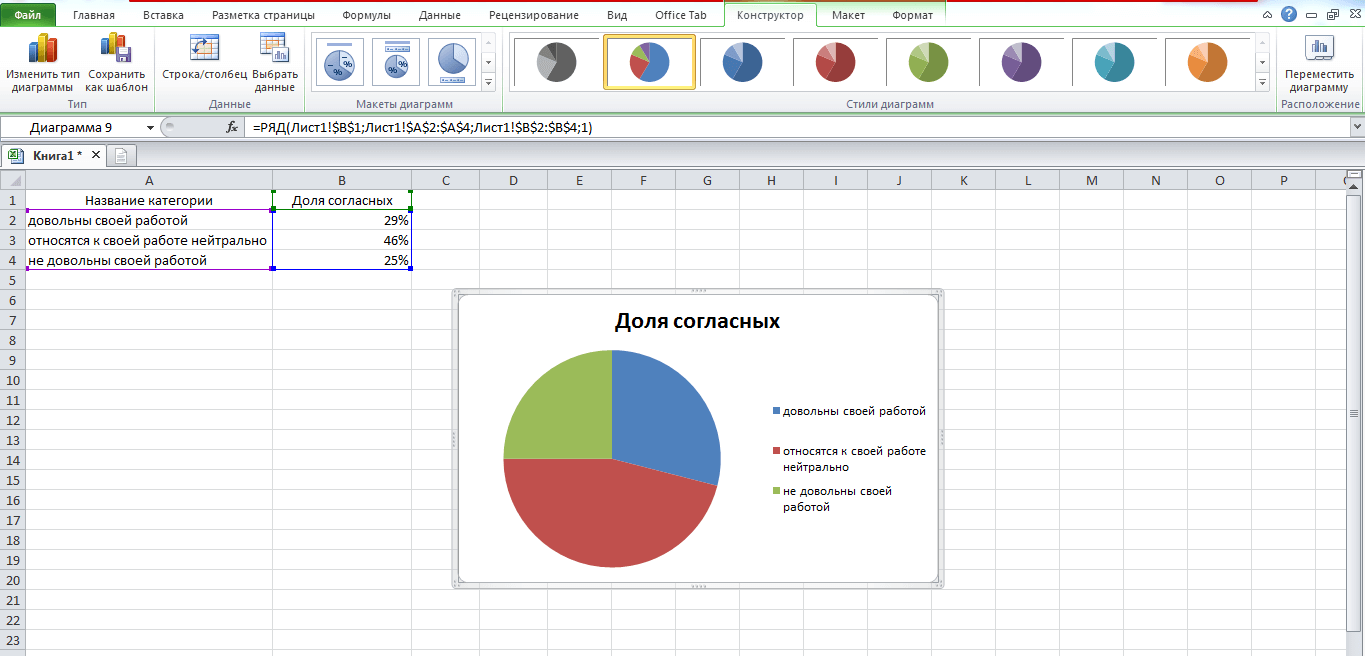
Building histogramThis is another popular and convenient chart type, in which the number of different indicators is displayed as rectangles. The principle of building a histogram is similar to the process of creating a pie chart. So, first you need a table, based on the data from which this element will be created. 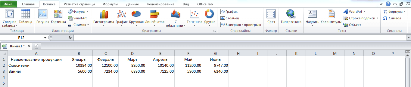
Next, you need to select the table and select the histogram you need from the “ Histogram ” section in the “ Charts ” group of the “ Insert ” main menu item. If you want to somehow modify the resulting histogram, then again, you can do it using the context menu and buttons at the top of the main program window. 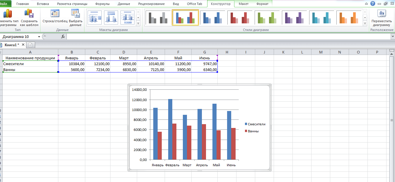
Thus, building graphs and charts in Microsoft Excel is, in most cases, a matter of several minutes (you can spend a little more time just creating the table itself and then formatting the chart). And even a Gantt chart, for which there is no special tool in the application, can be built quite quickly and easily using our step-by-step guide. The Topic of Article: Create graphs and charts in Excel like a Pro. |